Amazon’s user experience (UX) is constantly evolving to meet the needs of its global user base. This case study explores key UX features that enhance user interactions and identifies areas where improvements could be made. The aim is to demonstrate thoughtful design processes and strategic problem-solving in creating a user-centered online shopping environment.
Prime Switch
Amazon excels in making Prime features easily accessible. The integration of a “Prime” switch directly on the search results page allows Prime users to quickly filter items eligible for Prime benefits.
Search Bar Accessibility
Amazon’s search functionality is highly accessible due to its placement at the top of every page. This design choice ensures that users can quickly and easily find what they’re looking for, enhancing user flow and efficiency.
Buy Now Feature
Amazon’s “Buy Now” feature exemplifies the company’s dedication to an efficient user experience. By utilizing saved payment methods and addresses, this feature streamlines the checkout process for single-item purchases, allowing users to complete transactions with a single click.
Being able to save multiple addresses saves the user time and avoids the inconvenience of having to fill out item recipient information each time. It makes it more efficient during the checkout process and helps with the “Buy Now” feature. Users can also set a default address making it easier for the account holder to easily checkout. This helps eliminate the cognitive load of having to remember someone’s address or having to go through so many steps just to checkout.
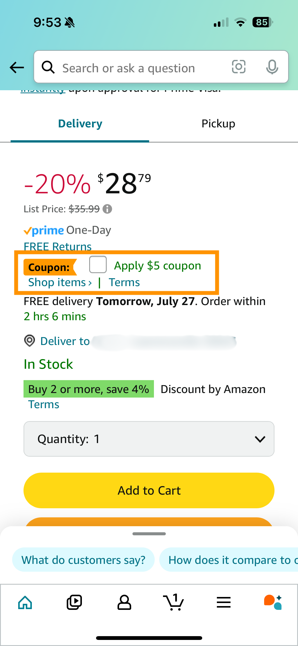
Amazon uses green text for coupons, the color green tends to make people feel positive and encourages them to take action. This means customers might be more interested in items with green coupons. The same idea is used in the green highlighted areas in the screenshot. By using green, Amazon makes deals more attractive and improves the shopping experience.

Sort By Feature Accessibility
This highlights the benefits of Amazon’s approach. The goal was to increase users’ reliance on Amazon’s algorithms, guiding them toward a specific selection of products that match their interests. By directing users in this way, Amazon enhances the shopping experience, making it easier for customers to find items they’ll love and simplifying the path to purchase.
The easy access to the reviews section of a product can be a pain point to users because it is displayed as a number of reviews rather than a clear and concise header. If a user doesn’t know what that number means, then they might not click it and just keep scrolling down until they get to the “reviews” section. This would be wasting the users time if their main goal is to look at the reviews of a product.
Streamlining User Reviews
Not being able to chat with the seller of a product makes it hard for users to ask questions and get more information about a product before buying it. This doesn’t fulfill the UX aspect of bridging the gap because it doesn’t help users get answers to their questions easily.
Direct Communication with Sellers
This case study highlights the continuous need for user-centered design in e-commerce platforms. By focusing on both enhancements and areas needing improvement, Amazon can further refine its UX to meet the evolving expectations of its users. Each feature discussed demonstrates a strategic approach to problem-solving and innovation within the UX field, aimed at creating a seamless and efficient online shopping experience.
Copyright © 2024 Nirali Parikh. All Rights Reserved.